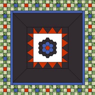
At last a plan and even some strips cut---making some progress. I believe this is kind of what this thing might look like though I am not so sure which of the fabrics will be used in the spacer area. I figure that I will make the blocks and then see what I think but am even leaning to the same black print that does not read so much dark in that spot as the colors in the 9 patches will play off it. The colors are not right in the triangle row, nor are the actual shapes---I was just being lazy about redrawing what actually exists.
As late as yesterday it was going to be 4 patches in two shades of green. Then last night Cher and I were chatting on IM and then I showed her nine patches--then somehow it evolved into what if you put another color at the centers of those nine patches? I didn't like that near as much but then decided to make the centers alternate with the two predominant colors in Lauren's grandmother's flower garden. Pam joined in later and voiced her approval of the change. Collaborative effort, dontcha know?
Below or wherever it lands on the page is the fabric that have to work with. The three on the left are the ones that Lauren used at center---the right the strips I will use for the nine patches. At back is the robin itself. I don't know that you can see the background fabric in the triangle area enough to tell that it has a real olive green-goldish thing going on. If you open the picture up, I think you can on the larger shot. Anyway that made the greens my choice rather than the blues I originally purchased for this my choice. It needs to be lightened up a bit. The lighter green bridges the colors between all that dreary black but hopefully without it being too big of a contrast that a lighter color would be . I definitely was not going to bother trying to draw the leaves and veins when I can see them up close and personal, LOL
So at least I have an idea of where I am going today--once I get some Monday errands run, that is. Mostly I just want this done and moved along at this point. Hopefully in a couple of days or by midweek you will see the finished product. I will take suggestions about what you think should go in the spacer based on what you see at this point. Too much rust and I still think it will look like Halloween, LOL but the darker blue might not be bad thought and carrying that black print she fell in love with might not be a bad idea either. Decisions, decisions---making my head hurt!
The quilt group meets tomorrow so I will lose some sewing time but there is tons of binding that can be done rather than lugging my sewing machine. Oh, it's raining and he's off the golf course--hope he is not getting soaked. I can wait it out for the store trip but DJ's out in it. 


Oh yes, I REALLY like the nine-patch border - and your color choices will definitely help to brighten up the quilt without distracting. Good job!
ReplyDeleteIt's going to look great. Love your color choices.
ReplyDeleteI think ya'll did good with your collaborative effort. I do like the different color in the center and that you've used 2 different ones. I haven't done a RR in a long time but do remember what a challenge it can be to come up with something that would work with all the borders that had gone before but not look too busy. Can't wait to see it when you finish your round.
ReplyDeleteThat design looks lovely for the RR!
ReplyDeleteI like the colors you chose, perfect!! The rich creamy beige is just light enough that it will lighten up all that black but not white enough to make it look like 2 quilts sewn together! Great choice! After looking at all the options, I agree no gold/orange in the space, too halloween. I would go with the large black print on the far left. I think it will pull out the print from the center. As it is now it gets lost a bit, and you said she fell in love with it right? SO putting a line of that will pull it out and tie it in incase she want to make some of a larger outer border using that one too. It won't look so disjointed if it's sprinkled in along the way to the outer edge. Know what I mean?
ReplyDeleteI pick floral large black print! Definitely!
this is really coming together well. Way to go.
ReplyDeleteCreat fabric choices and block pattern. I think the 9 patches looks great with the alternating color centers...seems to stablize all the darkness.
ReplyDeleteI like the border. I think it brings out the center design great.
ReplyDeleteWow! I love your plan. It looks gorgeous. You are so talented with the computer!
ReplyDeleteI agree with Judy...great print...with all the colors you are putting into the nine patches-it's my choice as a winner!
ReplyDeleteYou know I just read this post again and PAINT!!?? Oh my I would have a fit! Definitely something to make as a new rules next time you do one of these. NO PAINTED STUFF.
ReplyDeleteYikes!